Small kitchens have a visibility problem. Every square foot of floor is partially hidden by cabinets, appliances, and an island if you have one. The tile you choose — and especially the size — directly affects whether the room feels cramped or open.
Here's what actually works.
The Rule: Fewer Grout Lines = Bigger Feel
Grout lines break up the floor visually. Every line is a boundary that your eye registers, subdividing the space into smaller units. More grout lines mean more visual breaks, which makes a room feel smaller.
This is why larger tiles generally make small spaces feel bigger. A 24×24 tile on a 100 sq ft kitchen floor creates roughly 25 tiles with minimal grout lines. A 6×6 tile on the same floor creates around 400 tiles in a dense grid. The visual difference is dramatic.
But "go big" isn't the whole story. There are practical limits.
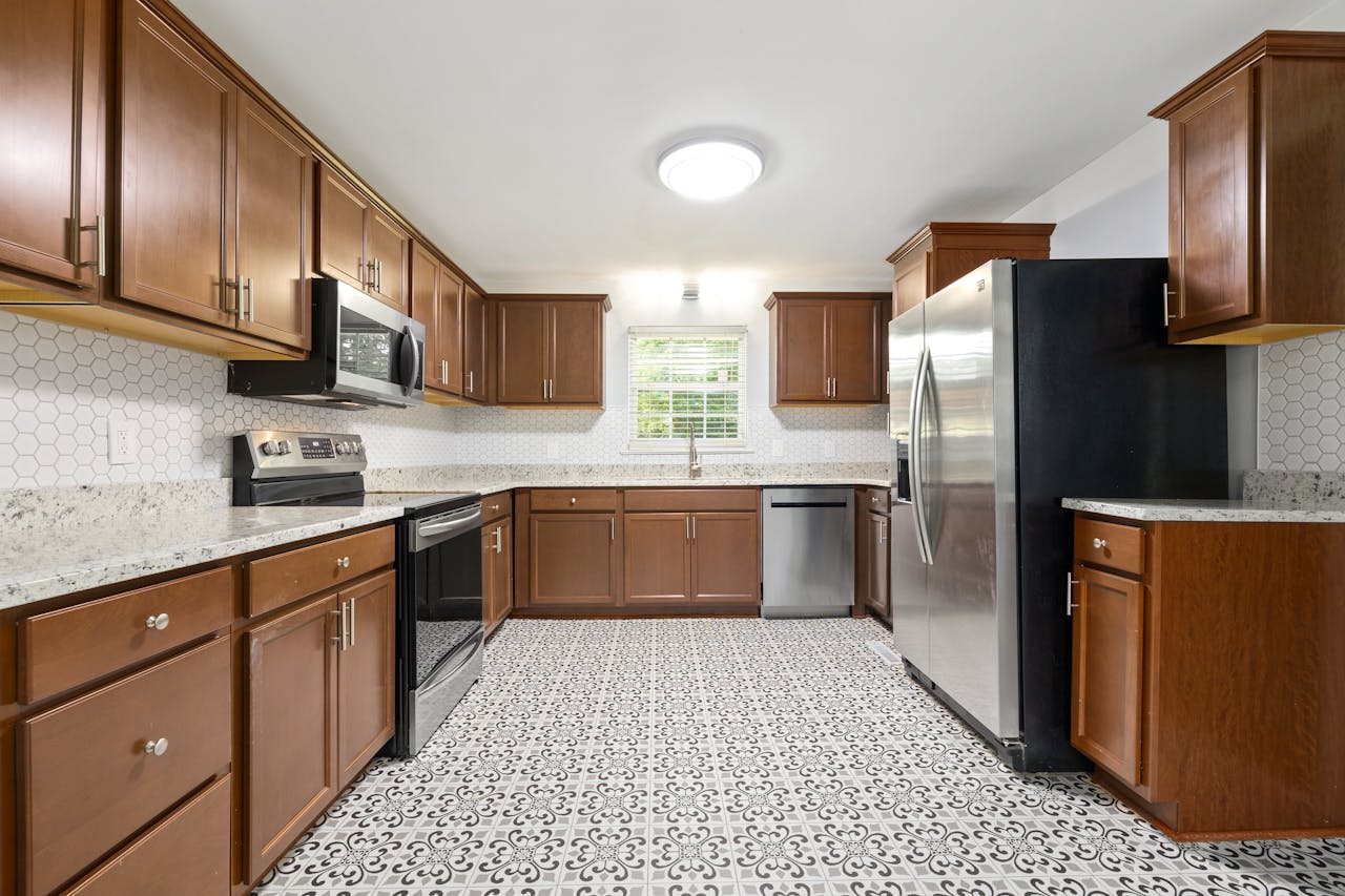
Recommended Sizes for Small Kitchens
12×24 (Best All-Around Choice)
The 12×24 format is the sweet spot for small kitchens. It's large enough to minimize grout lines, the rectangular shape creates a sense of direction and flow, and it's manageable to cut and install. Laid with the long side perpendicular to the longest wall, it visually widens a narrow kitchen.
18×18
A solid square option. Fewer grout lines than 12×12 without the challenges of very large format tiles. Works well with a straight lay or diagonal pattern.
24×24
Maximum floor coverage per tile. Excellent in small kitchens with open floor plans. The challenge: large tiles need a very flat subfloor (within 1/8" over 10 feet), and cutting them for a small kitchen with lots of obstacles means more waste.
What About 12×12?
Still works fine. It's the classic size and won't make your kitchen feel small on its own — especially with well-matched grout. But if you're choosing between 12×12 and 12×24, the larger format wins every time for perceived space.
Avoid Going Too Small
Mosaic tiles (2×2, 1×1), small hexagons, and 4×4 tiles create busy floors that shrink a small kitchen visually. They have their place — accent walls, shower floors, backsplashes — but not on a small kitchen floor where you want to maximize perceived space.
Layout Patterns That Help
The pattern you lay matters as much as the tile size. Different layout patterns create different visual effects:
Straight Lay (Grid)
Simple, clean, and doesn't fight for attention. Lets the tile size do the work. Best for very small kitchens where you don't want the floor competing with everything else in the room.
Offset / Brick Pattern
The most popular kitchen floor layout. The stagger breaks up the grid monotony without adding visual chaos. A 1/3 offset with 12×24 tiles is modern and effective. Avoid 50% offset with rectangular tiles — it can create a visual "zigzag" that makes floors look uneven.
Diagonal Lay
Laying square tiles at 45° draws the eye along the room's diagonals, which are the longest lines in any rectangular space. This genuinely makes rooms feel bigger. The tradeoff: more cuts at the walls and slightly more waste.
Herringbone
Looks stunning but creates a lot of visual activity. In a very small kitchen, herringbone can feel busy rather than spacious. It works better in medium kitchens or long, narrow galley layouts where the pattern creates directional flow.
How Cabinets Affect the Decision
Here's what most tile-size articles miss: in a kitchen, cabinets cover 40–60% of the floor perimeter. You're only seeing the center of the room and a few inches along the toe kicks.
This matters because:
- Large tiles that get cut to tiny slivers along cabinets look bad. If your layout results in 2" strips along the toe kick, either shift your starting point or choose a smaller tile.
- The visible floor is the center aisle. That's where tile size has the most impact. Focus on what that center area looks like with your chosen tile.
- Under-cabinet lighting changes perception. If you have toe-kick or under-cabinet lighting, it highlights the floor along the edges — making grout lines more visible there.
Before committing, plan your layout with the actual room dimensions and cabinet positions. What looks good in theory sometimes produces awkward cuts in practice. TilePlan can show you exactly where cuts fall so you can adjust before buying materials.
Island Considerations
If your small kitchen has an island (many do now, even in compact layouts), it creates another set of tile boundaries around its base.
- Tile should run continuously under or around the island. If the island is permanent, tiles must be cut to fit around its footprint. This adds grout lines in the center of the room — exactly where you want the floor to look cleanest.
- Larger tiles minimize the visual impact of island cuts. With 24×24 tiles, you might only need cuts on 2–3 tiles around the island. With 12×12, that number doubles.
- Align the tile layout to the island, not the walls. If your island is centered in the room, starting your tile layout centered on the island produces more symmetrical cuts on all sides.
Grout Color Impact
Grout color is the secret weapon for making small kitchens feel bigger. This is often more impactful than tile size itself.
Match the Grout to the Tile
When grout color closely matches the tile color, grout lines nearly disappear. The floor reads as one continuous surface. This is the single most effective trick for maximizing perceived space.
Light tile + light grout is the classic combination. White, off-white, or light gray tiles with closely matched grout creates a seamless, airy floor.
Contrasting Grout
Dark grout on light tile (or vice versa) emphasizes the grid pattern and makes every line visible. This is a deliberate design choice — it looks great in the right context — but it visually shrinks the room. In a small kitchen, avoid high contrast unless the pattern itself is the point.
Grout Width
Narrower grout joints (1/16" to 1/8") also reduce visual breaks. Rectified tiles (machine-cut edges) allow tighter joints than non-rectified. If you're optimizing for perceived space, choose rectified tiles and go with the minimum recommended grout spacing.
Color and Finish
Beyond size and grout, the tile's color and finish affect perception:
- Lighter colors make rooms feel bigger. Not groundbreaking advice, but it's true. White, cream, light gray, and pale wood-look tiles open up a space.
- Matte finishes feel more natural and modern but don't reflect light. Polished or semi-polished finishes bounce light around the room, which can make it feel larger — but they're slippery when wet.
- Consistent tones across the floor read as larger. Tiles with high variation (like multicolor natural stone) create visual texture that can make small floors feel busier.
Frequently Asked Questions
What's the best tile size for a galley kitchen?
12×24 tiles laid with the long edge perpendicular to the long walls. This visually widens the narrow space. A diagonal layout with 18×18 tiles also works well.
Will large tiles look weird in a small kitchen?
No — the opposite. Large tiles with fewer grout lines make small kitchens feel more spacious. Just make sure your subfloor is flat enough and plan cuts so you don't end up with tiny slivers along the edges.
Should I use the same tile in the kitchen and adjacent rooms?
Running the same tile continuously into adjoining spaces (dining room, hallway) eliminates the visual break at doorways and makes both rooms feel larger. It's one of the best tricks for small floor plans.
Does tile orientation matter?
Yes. Rectangular tiles laid with the long side perpendicular to the room's long dimension make the room feel wider. Parallel to the long dimension makes it feel deeper. Choose based on what the room needs.
How much bigger can the right tile make a room feel?
There's no precise measurement, but the difference between small mosaic tiles with contrasting grout and large-format tiles with matched grout is striking. You won't gain actual square footage, but the room can feel 20–30% more open.
Plan Your Tile Layout with TilePlan
Calculate materials, visualize patterns, and get accurate cut lists for any room shape.
Download Free on the App Store